Earlier this month I created some maps and graphics for a story by Shady Grove Oliver, published on AfroLA, on the roots of today’s disparate impacts of pollution in the segregation and racist planning processes of mid-20th century Los Angeles.
Oliver’s report takes a well-researched deep dive into the story behind the paradox of todays’ unequal impacts of air pollution in the car-dominated metropolis: those in poor, Black and brown areas with some of the least access to mobility are the most impacted from tailpipe emissions, while Angelenos in other communities, who often drive the most, are affected the least.
The graphics I made for the story illustrate how freeway construction – and future emissions concentration – were shaped by redlining. The route of the 210 Freeway, for example, cut right through Pasadena’s Black neighborhoods instead of being routed through less populated areas to the west.
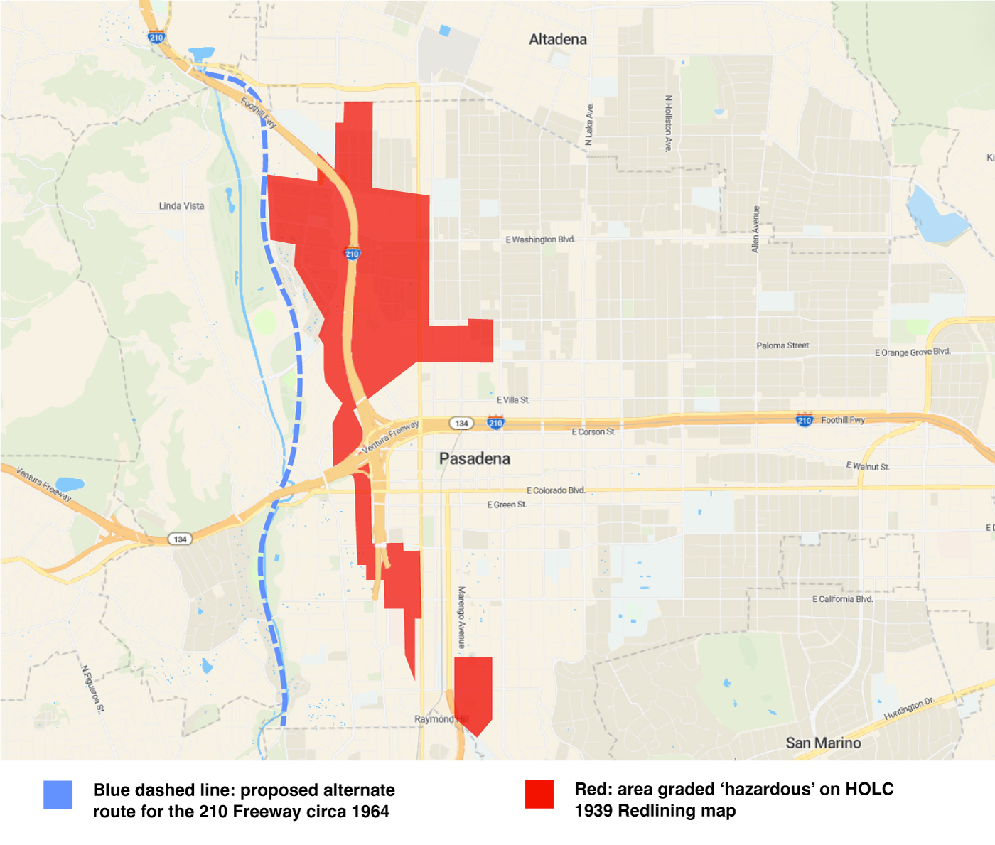
The 210 Freeway was built along one of two proposed routes. The alternate route would have avoided densely populated areas. However, the chosen route went directly through redlined neighborhoods where the majority of Pasadena’s Black population resided. Construction of the I-210 freeway displaced about 2,600 residents, whose 900 housing units were bulldozed. (Sources: Freeway routes from The Implications of Freeway Siting in California drawing from city planning documents; redlined areas from Home Owner’s Loan Corporation)
Where more economically advantaged and whiter communities were often able to avoid being carved up by freeways (such as the never-built Beverly Hills Freeway), others that had been marked as blighted were designated for freeway concentration: typically despite strong local objections by these communities. East Los Angeles and South Central were particularly impacted.
The following two interactive maps show juxtapositions of pollution concentrations with redlining on the one hand, and Covid-19 vulnerability/recovery on the other. In both, the pattern is unmistakable, with the concentrations of negative impacts following exclusionary housing and matching pollution concentration with Covid vulnerability.
The above pollution risk map shows low-to-high pollution levels from green (lowest percentile) to yellow (middle) to red (highest percentile). The redlining map compiles the Home Owners Loan Corporation “security maps” that were used to determine lending and real estate investment in the years prior to freeway construction in Los Angeles; green was “best,” blue “still desirable,” yellow “declining” and red “hazardous.” For full details on the maps visit CalEnviroScreen 4.0 and Mapping Inequality.
The above pollution risk map shows low-to-high pollution levels from green (lowest percentile) to yellow (middle) to red (highest percentile). The COVID-19 Vulnerability and Recovery Index map shows lowest (pale blue) to highest (dark purple) community risk. For full details on the maps visit CalEnviroScreen 4.0 and the COVID-19 Vulnerability and Recovery Index Dashboard.
Working on this was an opportunity I jumped at, since my MA thesis in English Studies looked at a novel set in East L.A. during the heyday of freeway construction and displacement there, and my research involved looking into the history of this area and eco-critical approaches to the text.
Please view the charts in context and read Shady’s story on AfroLA.