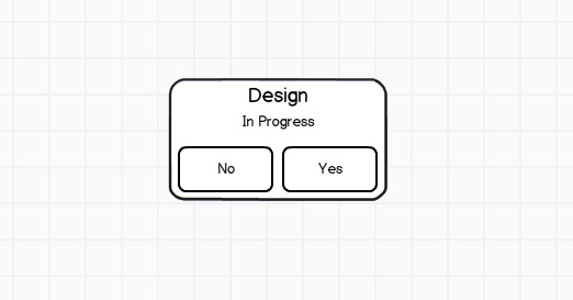
Over the years I’ve gotten increasingly into using wireframes to start rapidly sketching out designs and UX patterns for clients. It took me a really long time to notice the fact that these tools (Balsamiq, which I use, and others as well) use Comic Sans by default or even lock you into using Comic Sans.
Now, few typefaces polarize opinion like Comic Sans (see “I’m Comic Sans, Asshole” for the font’s perspective on all this).
What shocked me, as a designer and type snob who stares at beer bottle labels and chocolate bar packaging trying to figure out what fonts they used, is that I’d been using Comic Sans—actually sending documents I’d created with the ridiculed font in them to clients—without even realizing it.
Which proves two things: one, that I can be really unobservant, and two, that every font has its place. Like the monologue has it, Comic Sans is great for contexts in which the critical thing is not to be taken too seriously. Which is exactly the case for wireframes.
I don’t want my client to fall in love with the typeface in the wireframe, any more than I want them to literally think that the header in the wireframe is going to be exactly that tall or wide, etc. Comic Sans helps ensure this. So I’ve decided I’m cool with it.
For now.
You two are doing some great stuff at the Creosote Journal-hope all is well!
Dan and Laura
Hey, thanks Dan and Laura!